Catalyst Creamery: Revolutionary
Plant-Based Cheese
Catalyst Creamery founder Katie Jones sought to revolutionize the dairy industry through sustainable, animal-free cheese alternatives. As a food sustainability podcast host committed to environmental responsibility—from biodegradable cheese wraps to plant-based ingredients—Katie needed a visual identity and packaging design that balanced her revolutionary mission with consumer familiarity. Eye Candy Design created a complete brand identity and packaging system for five cheese flavors, drawing from vintage bottle cap aesthetics to marry innovation with nostalgic dairy tradition.
CLIENT: CATALYST CREAMERY
“Thanks for all your hard work. You are a design wizard!”
BRANDING
PACKAGING DESIGN
MARKETING COLLATERAL
The Challenge
Positioning Plant-Based Innovation in Traditional Dairy Market
The plant-based cheese market faces unique positioning challenges. Vegan cheese alternatives must differentiate themselves from traditional dairy while maintaining enough familiarity to attract curious consumers who associate cheese with specific visual and cultural expectations. Katie's comprehensive sustainability approach—from product formulation to packaging materials—required design that communicated both innovation and responsibility.
Key challenges included:
Creating visual identity that felt both revolutionary and familiar
Balancing playful, modern branding with traditional dairy nostalgia
Communicating sustainability values without appearing preachy
Designing packaging for five distinct flavors plus experimental varieties
Developing educational materials about plant-based cheese care and storage
Differentiating in the growing vegan cheese market while appealing to mainstream consumers
Our Strategic Design Solution
Vintage Charm Meets Revolutionary Spirit
Our comprehensive branding and packaging approach captured Katie's mission through visual storytelling that honored dairy tradition while celebrating plant-based innovation. The solution combined nostalgic design elements with cheeky modern personality.
Logo and Brand Identity Development
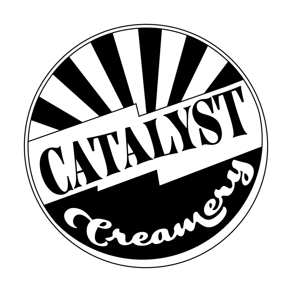
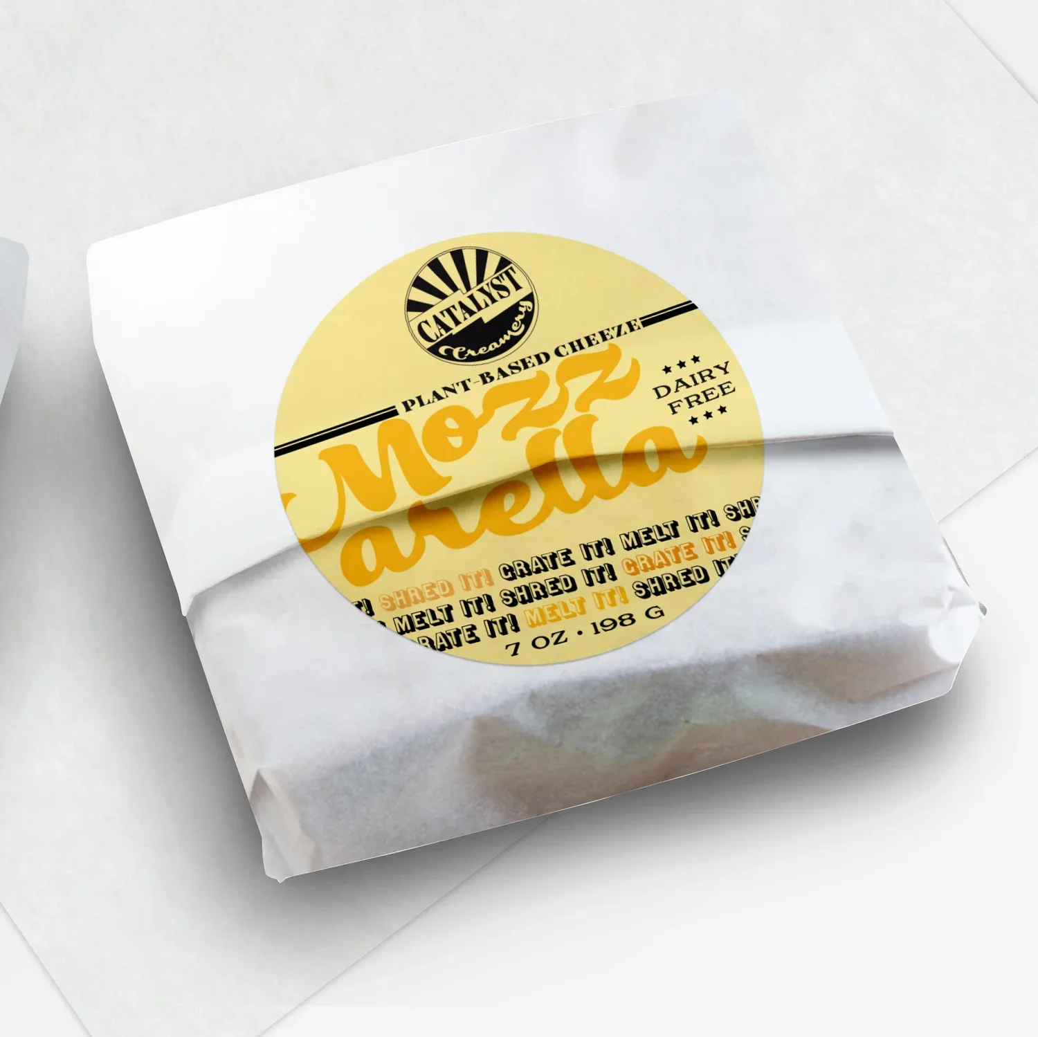
Vintage Bottle Cap Inspiration: Drawing from classic bottle cap designs, we created a logo that married the contrasting words in "Catalyst Creamery"—the revolutionary "catalyst" with the traditional "creamery." This fusion communicated both innovation and familiar comfort.
Playful Typography: The carefully selected typefaces balanced tradition with whimsy, reflecting the brand's personality as both serious about sustainability and approachable for consumers exploring plant-based options.
Nostalgic Yet Contemporary: The logo design caught attention and sparked curiosity, inviting customers to discover what made Catalyst Creamery different from both traditional dairy and other vegan alternatives.
Comprehensive Packaging System
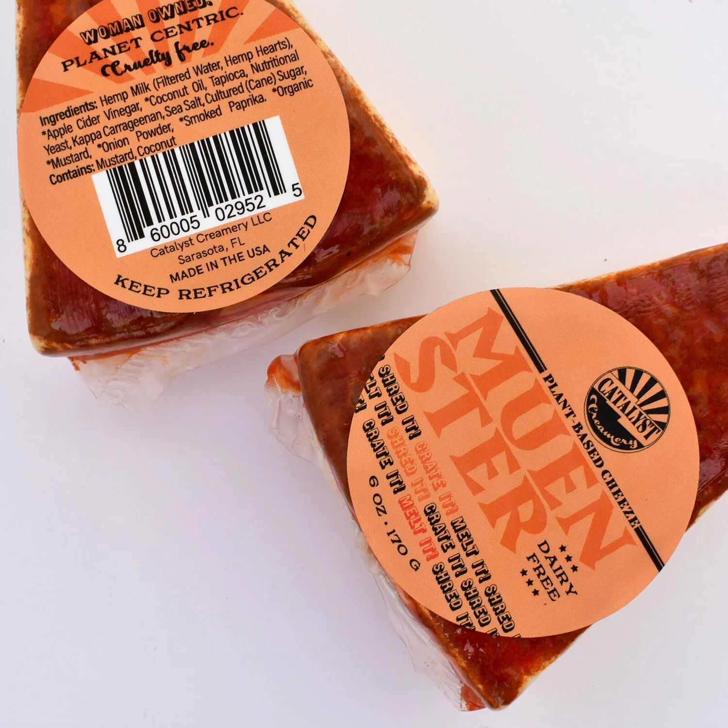
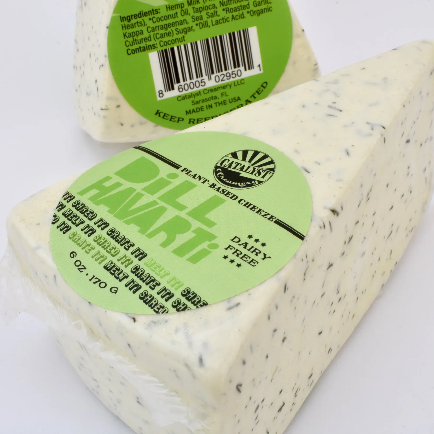
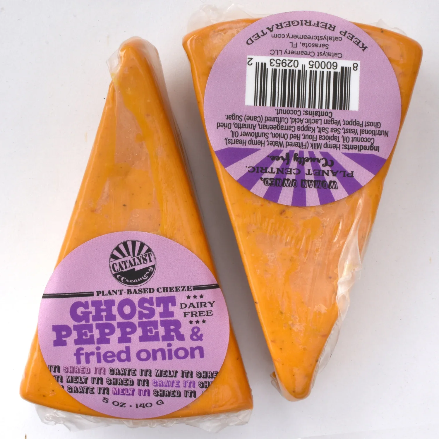
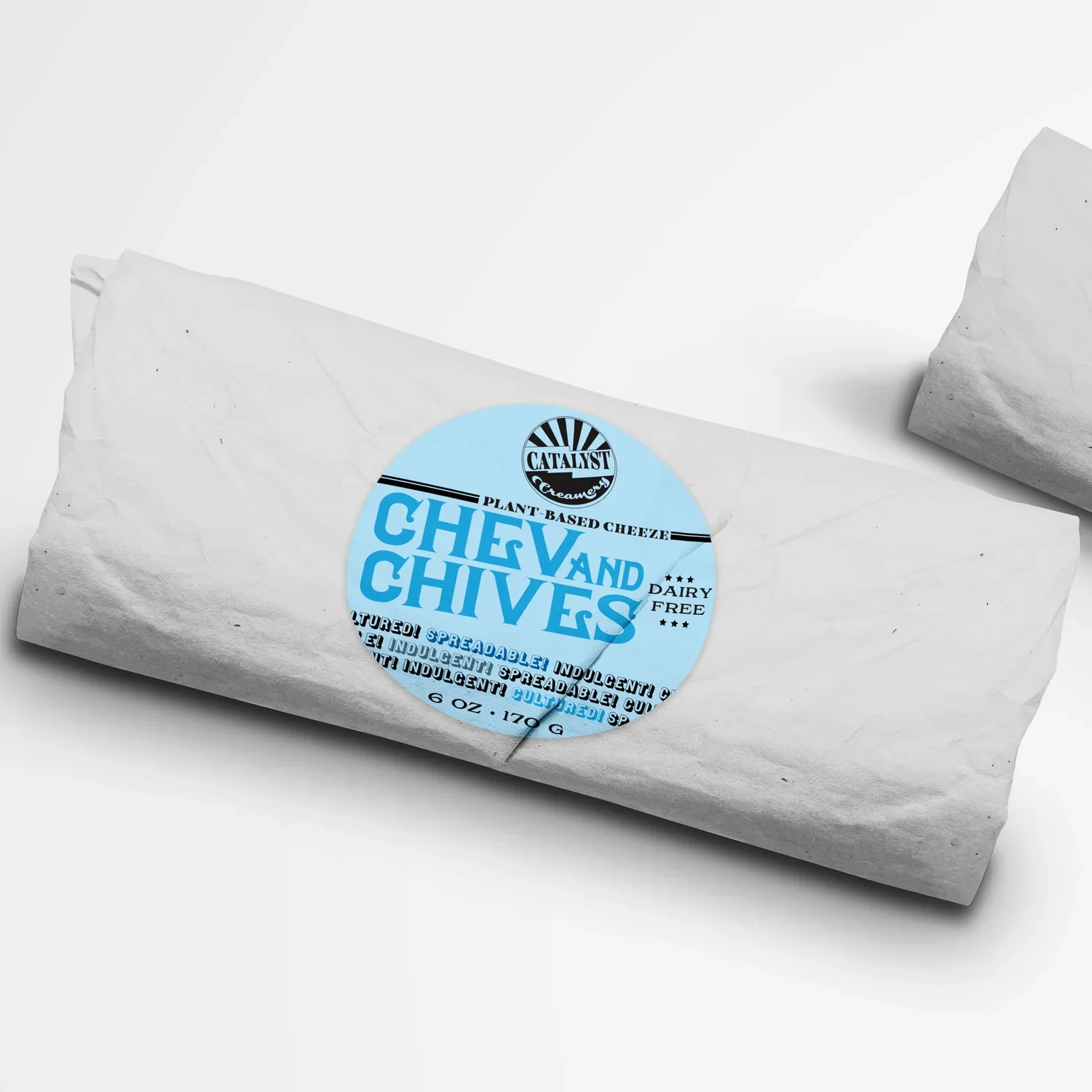
Five Core Flavors: We designed distinctive labels for Dill Havarti, Muenster, Ghost Pepper, and two additional flavors, each with unique personality while maintaining cohesive brand recognition.
Experimental Flavor Template: Created a flexible design template allowing Katie to fill in flavor names and ingredient lists for limited-edition and seasonal varieties, supporting product innovation without additional design costs.
Vintage Dairy Aesthetic: Packaging drew inspiration from vintage dairy advertisements, creating nostalgic appeal while feeling fresh and contemporary. Playful illustrations and cheeky slogans added personality and communicated the brand's revolutionary mission.
Sustainability Integration: Eco-friendly packaging options aligned with Katie's commitment to biodegradable materials and environmental responsibility, ensuring the packaging itself reflected brand values.
Educational Support Materials
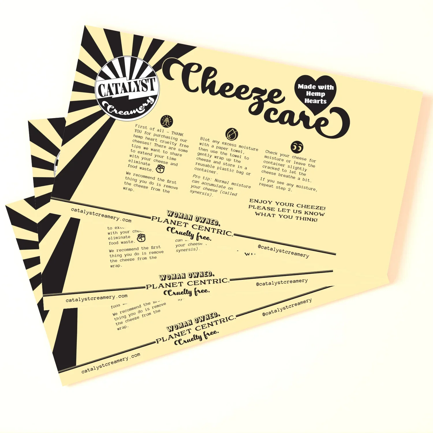
"How to Store/Care for Your Cheeze" Postcard: Recognizing that plant-based cheese requires different handling than traditional dairy, we created an informational postcard included with each product. This educational piece helped customers succeed with their purchase while reinforcing brand expertise and care.
Results & Market Impact
Revolution Through Design
The Catalyst Creamery branding and packaging successfully positioned the brand in the competitive plant-based dairy market:
Shelf Standout: The vintage-inspired yet contemporary design captured consumer attention among both traditional dairy and vegan cheese alternatives, creating immediate brand recognition.
Mission Communication: The slightly cheeky, familiar aesthetic communicated Katie's revolutionary approach without alienating mainstream consumers curious about plant-based options.
Customer Education: The informational postcard addressed a critical pain point for new plant-based cheese consumers, improving product success rates and customer satisfaction.
Scalable System: The experimental flavor template enabled ongoing product innovation, allowing Katie to test new varieties and respond to market trends without design bottlenecks.
Sustainability Storytelling: The combination of vintage charm, biodegradable materials, and transparent ingredient communication reinforced Katie's authentic commitment to walking the walk on sustainability.
Key Insights for Plant-Based Food Branding
Familiarity Reduces Barriers: When introducing alternative products, nostalgic design elements help consumers feel comfortable trying something new by connecting innovation to familiar traditions.
Authentic Mission Communication: Katie's genuine commitment to sustainability—from podcast to product to packaging—created authentic brand storytelling that resonated beyond typical green marketing.
Education Drives Success: Providing care instructions for unfamiliar products reduces customer frustration and returns while building brand trust and expertise.
Playful Beats Preachy: Slightly cheeky, approachable branding communicated serious sustainability values more effectively than earnest, heavy-handed messaging.
Template Systems Enable Growth: Flexible design templates for experimental flavors supported entrepreneurial innovation without requiring constant design investment.
Conclusion
Catalyst Creamery demonstrates how thoughtful branding and packaging design can support revolutionary food businesses making genuine sustainability commitments. By drawing from vintage bottle cap aesthetics and traditional dairy nostalgia, we created visual identity that made plant-based cheese innovation feel both exciting and familiar.
The comprehensive approach—logo development, multi-flavor packaging system, experimental templates, and educational materials—provided Katie with a complete brand platform to support her mission of changing the world through sustainable food choices. The slightly cheeky yet nostalgic design perfectly captured the balance between revolutionary spirit and comforting tradition.
Katie's success shows that bold ideas coupled with strong visual identity can truly make an impact. The Catalyst Creamery brand now stands out on shelves, attracting consumers seeking innovation while providing the nostalgic familiarity that makes trying plant-based alternatives feel less risky and more rewarding.

