Moving beyond the "ethnic aisle" requires a design strategy that celebrates history without relying on clichés. Here is how modern food brands are turning cultural roots into retail royalty.
The Return to Roots in a "Permanxious" World In the volatile landscape of the 2025 Canadian consumer market, a surprising trend has emerged: the return to roots. Amidst economic uncertainty ("permanxiety") and the digital abstraction of AI, consumers are craving the tangible, the authentic, and the human. For Food & Beverage CPGs, this shift represents a golden era for heritage and "ethnic" brands—provided they can navigate the delicate balance between tradition and modernization.
We call this the "Passport Effect." Successful packaging no longer merely protects the product; it acts as a cultural document, guiding the consumer on a journey of discovery. It turns a jar of sauce or a bag of spices into a ticket to a specific region, history, or family table.
The End of the "Exotic" Narrative For decades, North American grocery retail segregated global flavours into the "International" or "Ethnic" aisle—a dusty, poorly lit section often defined by visual stereotypes. In 2025, that narrative is collapsing. Global flavours are now mainstream staples. Korean Gochujang, West African Shito, and Mexican Mole are vying for prime real estate alongside ketchup and mustard in the "centre store."
However, moving to the main aisle requires a visual language that speaks to a broader audience without diluting the brand’s soul. The modern consumer, particularly Gen Z, possesses a high radar for "tokenism." They reject packaging that relies on caricatured fonts (like "Wonton" typefaces) or generic cultural clip-art. They demand specific, respectful celebration.
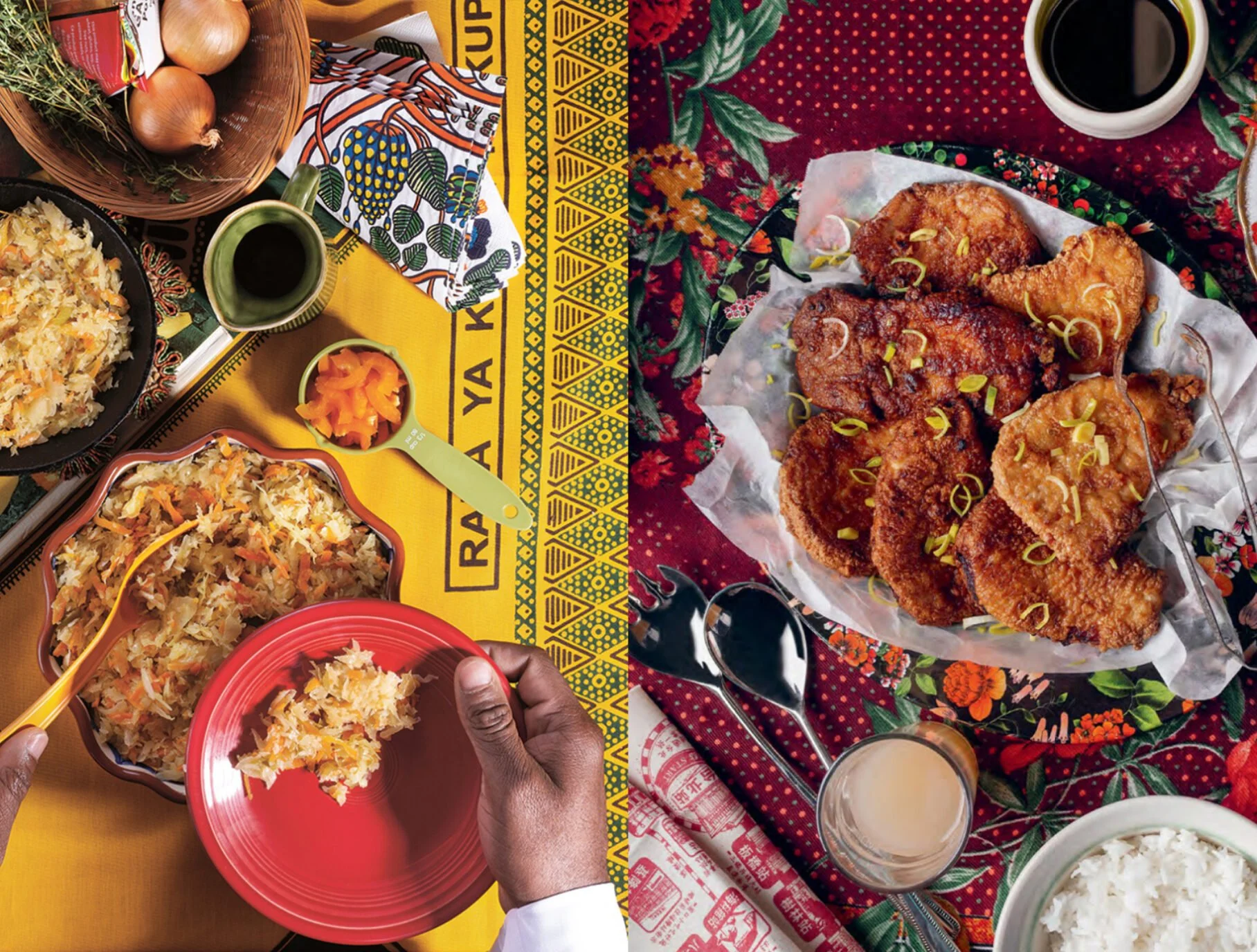
Neo-Heritage: The Visual Trend of the Year The design world’s answer to this demand is "Neo-Heritage." This aesthetic trend, dominating 2025, merges the warmth of the past with the precision of the future.
Typography: We are seeing a resurgence of hand-drawn, 1950s-inspired lettering that feels human and imperfect, paired with clean, utilitarian sans-serif secondary fonts for readability.
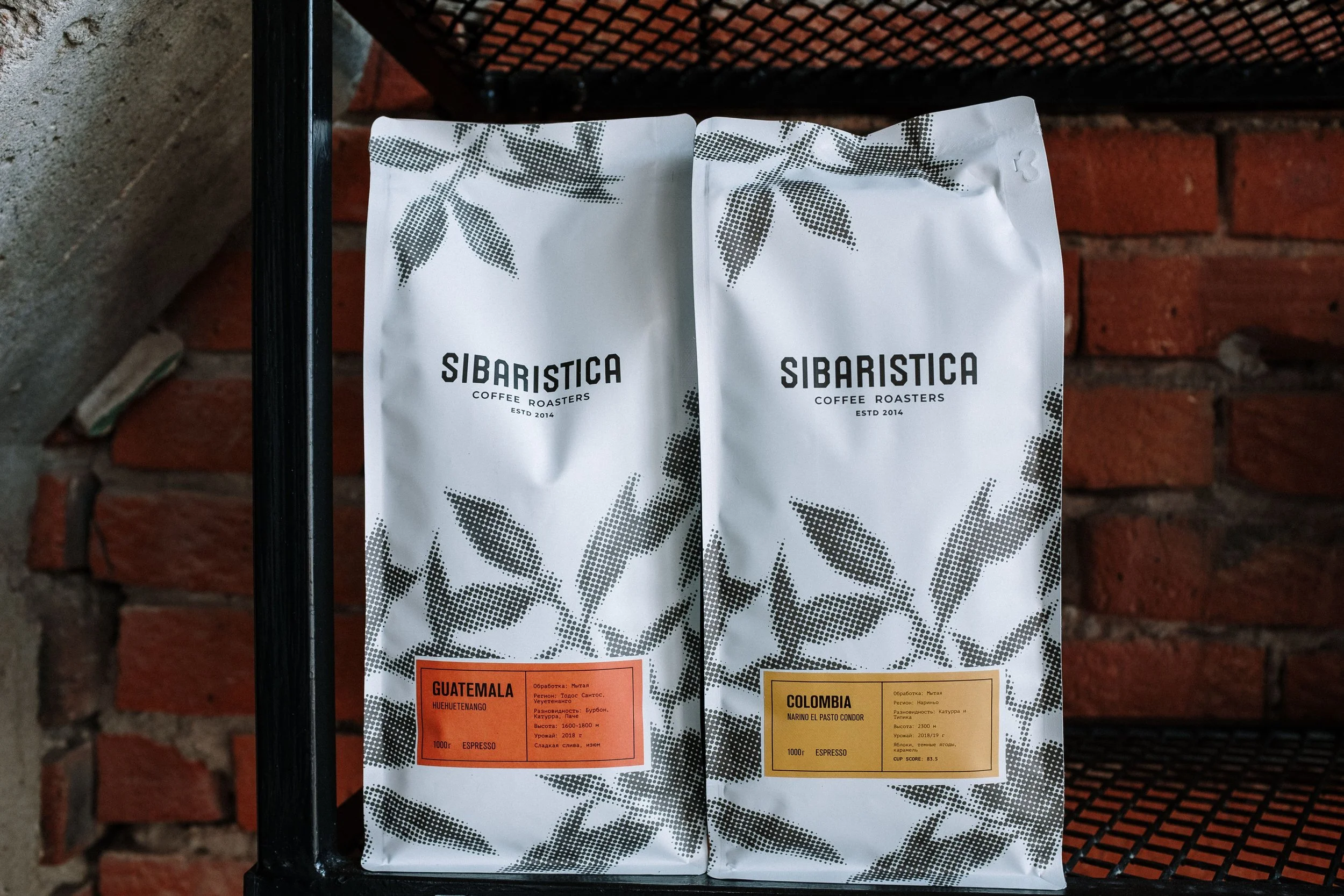
Colour Palettes: The "Brown Sugar" effect is taking hold—warm, earthy tones like ochre, terracotta, and deep gold are replacing the hyper-saturated, artificial neons of the early 2020s. These colors signal "slow food," comfort, and natural ingredients.
Storytelling: The back-of-pack is becoming as important as the front. It is the place for the founder’s story, the region of origin, and the specific agricultural history of the ingredients.
Case Study in Thinking: The "Fuss-Free" Translation For a heritage brand to scale, it must solve the "usability gap." A consumer may want to buy an authentic product but may be intimidated by how to use it. Innovative packaging bridges this gap not by dumbing down the product, but by clarifying the usage. This involves "smart systems"—clear visual hierarchies that rank information:
The Flavour Cue: (e.g., "Spicy & Citrusy")
The Format: (e.g., "Simmer Sauce")
The Cultural Context: (e.g., "A recipe from the Kerala region")
The Local Advantage: For brands based in agriculturally rich regions like Southwestern Ontario, there is a double heritage to celebrate: the cultural origin of the recipe and the local origin of the fresh ingredients. A brand producing kimchi in London, Ontario, using local cabbage, has a powerful dual narrative. It connects the "Passport" of Korean tradition with the "Place" of Canadian agriculture.
The future of food is diverse, but the shelf is crowded. Brands that attempt to hide their heritage to blend in will be ignored. Brands that caricature their heritage will be cancelled. The winners will be those who use design as a tool of celebration—creating packaging that feels like a welcome invitation to a new world of flavor.