
In a world where first impressions are everything, packaging design has evolved far beyond merely protecting products—it now tells stories, evokes emotions, and cements brand identities. The year 2024 has been a veritable playground for creative minds, with brands pushing the envelope in ways that blend functionality, innovation, and a deep sense of nostalgia. From reimagining heritage icons to infusing modern flair into everyday products, the top packaging designs of 2024 are setting new benchmarks for how brands engage with consumers. Today, we’re thrilled to share Amanda DeVries RGD’s curated selection of the five most exciting packaging designs of the year. Let’s dive into these inspiring creations and explore what makes them so uniquely compelling.
1. Drizzle Drizzle: Graza’s Bold Olive Oil Revolution
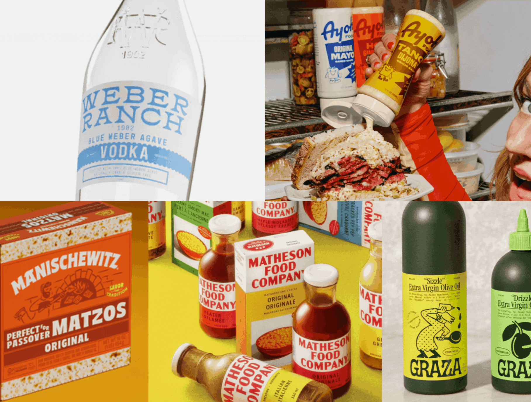
When innovation meets tradition, the result can be revolutionary. Although the brand Drizzle Drizzle launched back in October 2022, 2024 has been the year when everyone couldn’t stop talking about Graza. This packaging design reimagines how we experience one of the world’s oldest culinary staples—olive oil—by introducing a product that is as visually striking as it is functionally brilliant.
A New Standard in Culinary Packaging
Graza’s packaging isn’t your run-of-the-mill bottle found in every grocery aisle. Inspired by the precision that chefs demand in their kitchens, the design incorporates a narrow-nozzle plastic bottle—a format typically reserved for dressings, marinades, and other culinary essentials. This choice isn’t just about aesthetics; it delivers a level of precision and control that professional chefs and home cooks alike appreciate. Imagine drizzling that perfect amount of single-origin olive oil over a fresh salad or finishing a dish with just the right flourish—this packaging makes that possible.
The Story Behind the Design
At the heart of Graza’s success is its visionary founder, Andrew Benin. A transformative trip to Spain exposed him to the true taste of premium olive oil, an experience so profound that it spurred him to bring that authentic flavor to North America. Recognizing that great taste deserved equally great presentation, Andrew invested heavily in a packaging concept that could disrupt the single-origin olive oil market. The result? A product so striking that it not only captured the attention of culinary aficionados but also inspired numerous copycats attempting to ride on its coattails.
Why It Works
Graza’s design is a masterclass in marrying form and function. The narrow nozzle ensures that every drizzle is controlled, precise, and mess-free, enhancing the overall culinary experience. Moreover, the modern yet understated design appeals to a wide audience—from gourmet chefs who demand perfection to everyday cooks who appreciate quality. This packaging stands as a testament to how thoughtful design can redefine an age-old product category, elevating it from a pantry staple to a must-have culinary accessory.
2. Revitalizing Tradition: The Rebrand of a Legacy Ethnic Icon
Sometimes, true innovation means honoring the past while daring to look forward. In early 2024, the packaging world buzzed with excitement over the rebrand of Manischewitz—an iconic brand with a storied 136-year history. Spearheaded by the creative agency Jones Knowles Ritchie (JKR), this redesign isn’t just a facelift; it’s a strategic reinvention that bridges generations.
A Storied Past Meets a Vibrant Future
Manischewitz is more than just a brand—it’s a symbol of cultural heritage and tradition, cherished by generations who have relied on its products to celebrate and uphold Jewish customs. Historically dominating the Matzo market with an impressive 80% share in the U.S., the brand’s identity was steeped in legacy. However, as the consumer landscape evolved, so too did the need for a refreshed visual identity that resonates with younger audiences.
The Design Elements
The rebranded packaging for Manischewitz introduces a bright orange palette that immediately commands attention on the shelf. This bold color choice is complemented by fun illustrations that evoke the nostalgia of 1950s Jewish cookbooks and prayer books—an homage to the brand’s rich cultural tapestry. The lively, bold typeface further reinforces the design’s modernity, ensuring that while the brand remains deeply connected to its roots, it also speaks to today’s design-savvy consumer.
Balancing Heritage and Modernity
One of the most challenging aspects of rebranding a legacy brand is preserving its storied past while signaling a new era. Manischewitz’s updated packaging accomplishes this by maintaining visual nods to its heritage—subtle flourishes that longtime customers will recognize and appreciate—while integrating fresh, contemporary design elements that attract a broader, younger audience. This delicate balancing act ensures that the brand’s cultural significance is not lost in translation but rather reinvigorated for a new generation.
The Impact
The rebrand has generated significant buzz not only within the packaging design community but also among consumers who now see Manischewitz as both a trusted tradition and a vibrant, modern brand. It serves as a powerful reminder that even the most established brands can reinvent themselves in ways that honor their legacy while embracing the future.
3. Nostalgic Charm Meets Modern Flair: The Matheson Food Company Packaging
In an era where celebrity influence extends well beyond the screen, Matthy Matheson has proven that culinary expertise combined with a distinctive personal brand can create waves in the food industry. Known for his multifaceted career as a chef, restaurateur, actor, and internet personality, Matthy’s latest venture—the Matheson Food Company—is a delightful blend of nostalgia and modern design, brought to life by none other than Canada’s very own creative powerhouse, Wedge Studio.
A Celebrity’s Culinary Journey
Matthy Matheson’s journey from a celebrated chef to a household name in multiple entertainment spheres set the perfect stage for launching his product line. With a background steeped in culinary excellence and a persona that resonates with a diverse audience, Matthy knew that his product needed packaging that was as multifaceted as his career.
Wedge Studio’s Distinctive Touch
Enter Wedge Studio, a name synonymous with thoughtful, innovative design. Known for its impeccable attention to detail—from typography to color palettes and unique packaging formats—Wedge Studio has earned accolades such as Dieline’s Studio of the Year for 2024. Their work on the Matheson Food Company packaging is a masterful interplay of modern design elements with a nostalgic twist.
Design That Speaks to the Soul
The packaging for the Matheson Food Company is designed to evoke a sense of nostalgic charm while simultaneously appealing to contemporary tastes. It’s a celebration of comfort food that brings to mind warm, familiar memories of home-cooked meals and family gatherings, yet it is presented in a way that feels distinctly modern and fresh. This duality is a key element in its success—by appealing to both older generations who cherish tradition and younger consumers who value innovation, the packaging transcends generational divides.
Why It Matters
In today’s saturated market, where countless products vie for consumer attention, packaging that tells a story can be a game-changer. The Matheson Food Company packaging does just that—invoking the comfort of nostalgia while promising the excitement of modern culinary adventures. It’s a design that reminds us that good food and great design are not mutually exclusive but can, in fact, elevate each other to new heights.
4. Yassified Mayo: A Fresh Take on a Classic Condiment
In a market where innovation is often reserved for tech gadgets and high-end fashion, it’s refreshing to see that even the humble condiment is not immune to a design revolution. Yassified Mayo, the new line of mayonnaise launched by culinary influencer Molly Baz, is a prime example of how a familiar product can be reimagined to capture the zeitgeist of modern consumer culture.
Reinventing the Everyday
Mayonnaise has long been seen as a kitchen staple, rarely given the spotlight for its design. But Molly Baz’s new product line, intriguingly named “Ayoh” (and yes, we’re all here for the perfect name), challenges this notion. By infusing a traditional condiment with contemporary design elements, Ayoh transforms a seemingly mundane product into an eye-catching must-have item.
Design Highlights
Developed by the innovative minds at Center Design, the packaging for Ayoh is a vibrant blend of playful and functional elements. The design features cute sandwich characters that add a touch of whimsy and personality, instantly making the product relatable and fun. Moreover, the handy squeeze bottle is not just a nod to convenience—it’s a serious upgrade that ensures every dollop of mayonnaise is delivered with ease and precision.
The Cultural Impact
Ayoh’s packaging isn’t just about making mayo look good on the shelf; it’s a statement about how even the most basic products can be transformed with a fresh perspective. By integrating modern design trends with a product that has been a kitchen mainstay for decades, Yassified Mayo bridges the gap between old-school reliability and new-age style. It’s a reminder that innovation isn’t limited to new product categories—it can be found in rethinking the familiar.
Why It’s a Game-Changer
The success of Ayoh’s packaging design lies in its ability to resonate with today’s consumers, who crave both functionality and aesthetic appeal. It’s a design that challenges preconceptions, encouraging us to look at everyday items through a new lens. And in doing so, it elevates the entire condiment category, setting a precedent for how tradition and modernity can coexist beautifully on a single shelf.
5. The Allure of the Unconventional: Agave-Based Vodka Packaging from Fonts in Use
Sometimes, the most inspiring designs are discovered serendipitously, tucked away in design blogs and niche online communities. One such find came from Fonts in Use, a digital haven for typography enthusiasts and design lovers alike. Here, a project caught our eye—a packaging design for an agave-based vodka that defies convention with its unique bottle shape, distinctive typeface, and bold color palette.
A Design That Transports You
Imagine yourself on a sun-soaked beach, a refreshing cocktail in hand, and the gentle hum of cacti swaying in the background. That’s the vibe this vodka packaging evokes at first glance. It’s more than just a container for a spirit; it’s an invitation to escape, to embrace a laid-back lifestyle, and to experience a moment of pure, visual indulgence.
The Power of Typography and Form
What sets this design apart is its masterful use of typography and form. The unique bottle shape isn’t merely an aesthetic choice—it’s a strategic decision that makes the product instantly recognizable on crowded shelves. Combined with a thoughtfully chosen typeface that exudes both modernity and character, the packaging creates a sensory experience that goes beyond the liquid it contains. It’s an exploration of how form and function can work in harmony to create an emotional connection with the consumer.
A Bold Color Story
Color plays a pivotal role in this design’s success. The vibrant palette conjures images of tropical sunsets, desert landscapes, and vibrant cultural motifs. This bold use of color not only differentiates the product in a competitive market but also reinforces the idea that vodka—often seen as a straightforward spirit—can be as dynamic and captivating as its packaging suggests.
Why It Resonates
In today’s design landscape, where consumers are inundated with choices, packaging that tells a story and evokes a specific mood is invaluable. This agave-based vodka packaging does just that—it transports you to a different place, promising an experience that goes well beyond the beverage itself. It challenges the notion that functional packaging must be bland, instead proving that even a bottle can be a canvas for creativity and imagination.
Final Thoughts: The Future of Packaging Design
The packaging designs we’ve explored here are more than just visually appealing—they’re transformative. They illustrate how innovative packaging can:
Enhance User Experience: From Graza’s precision-engineered olive oil bottle to Ayoh’s functional squeeze bottle, these designs elevate everyday moments.
Bridge Generations: The rebrand of Manischewitz and the nostalgic charm of the Matheson Food Company packaging remind us that honoring the past while embracing modern trends is key to lasting appeal.
Challenge the Norms: Whether it’s reimagining a classic condiment or discovering an unexpected gem on Fonts in Use, these designs prove that creativity knows no bounds.
As we move further into 2024 and beyond, one thing is clear: packaging design is not merely an afterthought but a crucial element in the overall brand experience. It’s about telling a story, sparking joy, and creating a connection that goes far beyond the product itself.
What’s Next?
For brands looking to make their mark, these top five packaging designs serve as both inspiration and a call to action. They remind us that innovation and authenticity are not mutually exclusive—in fact, when they come together, the result can be truly unforgettable.
We invite you to join the conversation. What packaging designs have caught your eye this year? How do you think packaging influences your buying decisions? Share your thoughts in the comments below or connect with us on social media. Let’s continue to celebrate creativity and push the boundaries of what packaging can be.
In the dynamic world of consumer products, packaging is the silent ambassador of a brand’s identity. Whether it’s the precision of Graza’s olive oil bottle, the heartfelt rebrand of a cultural icon, the nostalgic-modern fusion in the Matheson Food Company packaging, the playful reinvention of a classic condiment, or the unconventional allure of agave-based vodka packaging, each design offers a glimpse into the future of how we experience products. Here’s to a year of bold, innovative design—and to the endless possibilities that lie ahead.
By exploring these top packaging designs of 2024, we see that the industry is shifting toward a more holistic approach where functionality meets storytelling. It’s not just about filling a shelf; it’s about filling our lives with experiences that are as rich, diverse, and vibrant as the designs themselves. So, whether you’re a brand looking to reinvent your packaging strategy or a design enthusiast eager to see what’s next, one thing is certain: the future of packaging is here, and it’s nothing short of inspiring.