Cafezia Coffee Rebrand
Cafézia offers a unique version of coffee that has been infused with tasteless herbs, giving it additional qualities of less stomach upset and less “jitters”.
Such a coffee has a very specific positioning in this category, and requires some degree of education to help consumers understand its benefits.
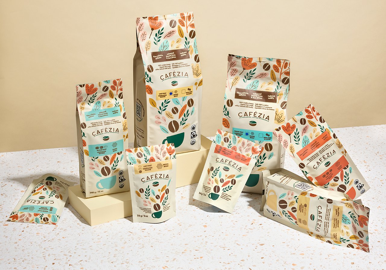
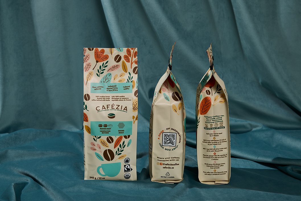
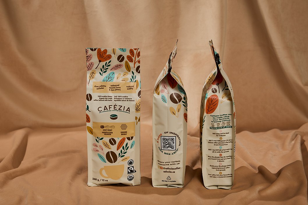
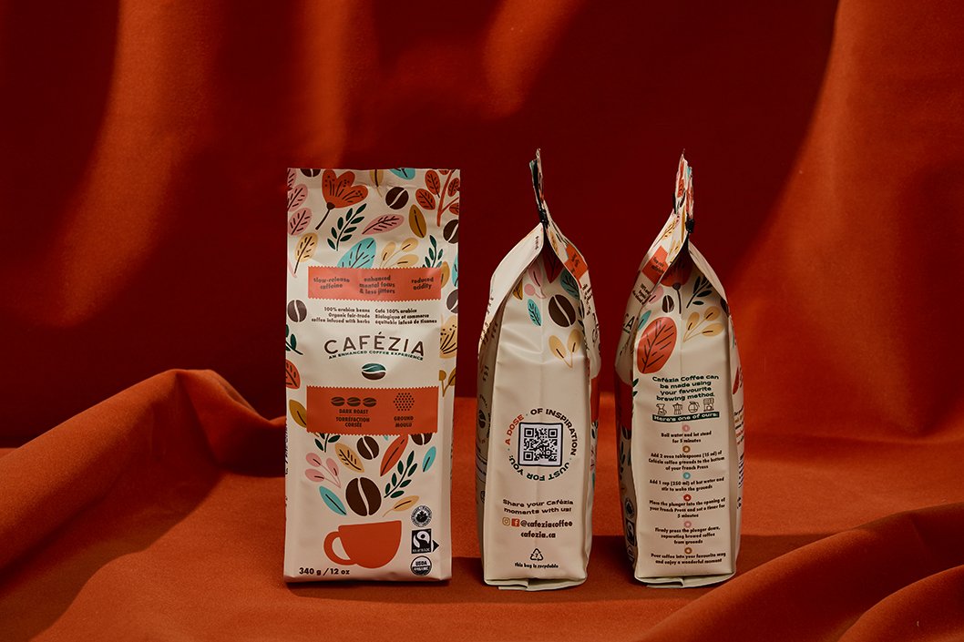
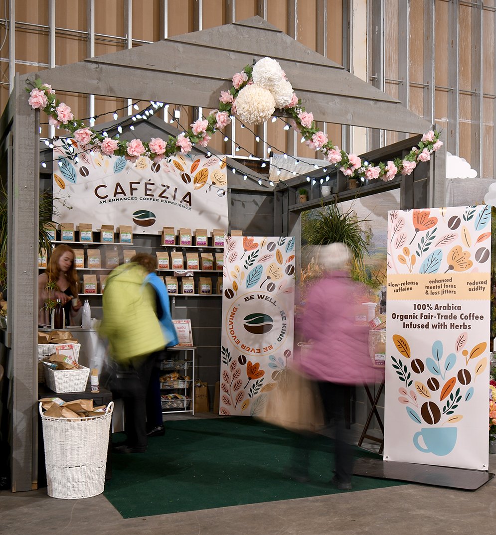
We put Cafezia’s value proposition squarely into both the branding and packaging with artwork that directly illustrates what you can expect to find within each bag.
The result was a 40% increase in sales both on and offline in the first year alone.
BRANDING
PACKAGING
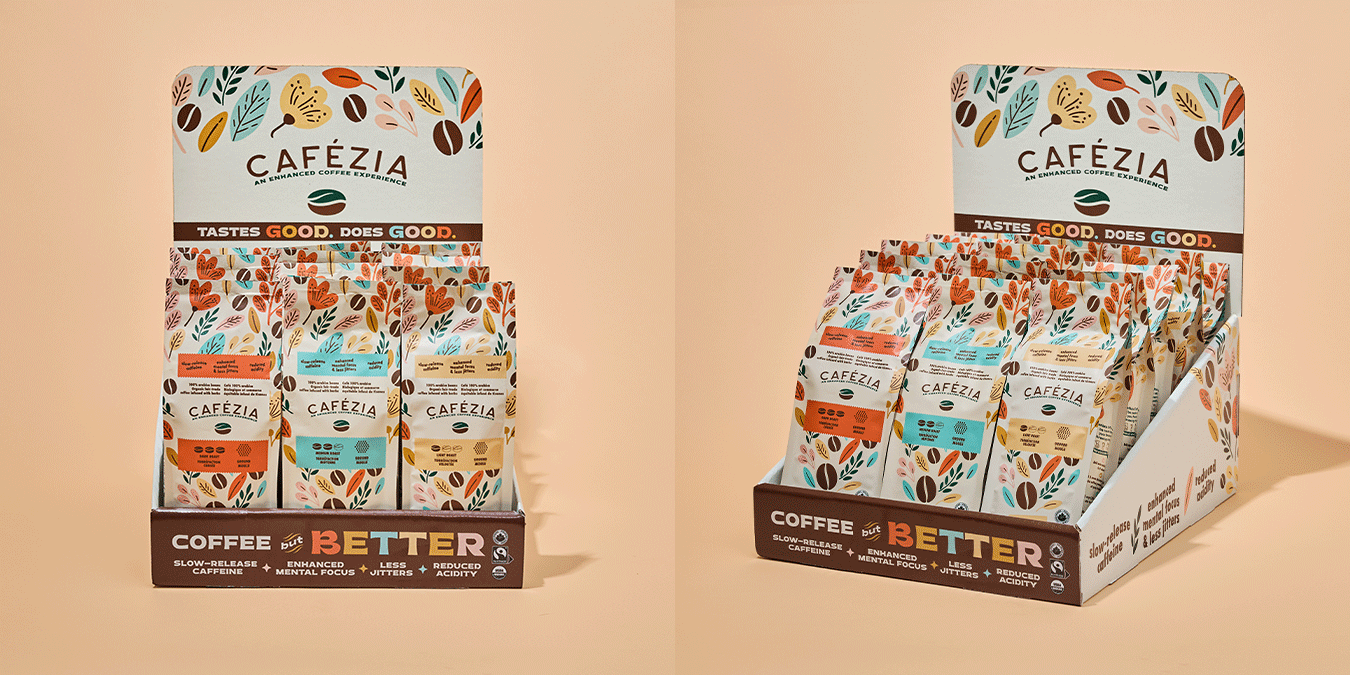
RETAIL-READY BOXES
FRONT END WEB DESIGN
ADVERTISEMENTS
See Our Similar Projects:
More Detail:
Problem
Cafézia is a coffee brand that offers a unique version of coffee infused with tasteless herbs, giving it additional qualities of less stomach upset and less "jitters". However, the product's unique positioning in the market required education to help consumers understand its benefits. The packaging and branding lacked appeal and did not clearly communicate the product's unique value proposition (USP).
Solution
Cafézia partnered with Eye Candy Design to revamp its packaging and rebrand the product. The primary goal was to convey the USP of the product through packaging and branding elements.
The new branding features a leaf and coffee bean combined to represent the brand as an icon, putting the USP directly into the logo. The packaging was designed with artwork that directly illustrates what consumers can expect to find within each bag.
Results
The rebranding effort had a significant impact on the brand's visibility and sales channels. Within the first six months of the rebranding, Cafézia's product was available in 25 additional cities in Ontario. Four new retailers purchased the product based solely on packaging and brand elements, without even trying the coffee first.
The on and offline sales channels saw a 40% growth as a result of the rebranding, which was a remarkable achievement. The brand received numerous compliments and attention for its design and aesthetics, boosting confidence to continue to grow and plan for bigger impact.
The investment, commitment, and risk of changing elements of a brand can be daunting. However, the success of Cafézia's rebranding efforts shows that taking risks can pay off in the long run.
Conclusion
Cafézia's rebranding and packaging revamp demonstrate how investing in packaging and branding can help brands differentiate themselves in a crowded marketplace. With a clear USP and eye-catching packaging, Cafézia was able to appeal to new retailers and grow its sales channels significantly. The rebranding effort resulted in a 40% growth in both on and offline sales channels and a wider presence in additional cities in Ontario. Cafézia's case study highlights the importance of clear communication of product benefits through packaging and branding to attract and retain customers.

