
Freeze-Dried Fruit Packaging Design
In the ever-competitive world of snack foods, standing out on the shelf is essential for success. When Bliss Snacks decided to launch a new line of freeze-dried fruit products, they turned to Eye Candy Design for a packaging solution that would preserve their established branding while making a splash in the healthy snack market. The perfect snack for on-the-go.
CLIENT: BLISS SNACKS
PACKAGING
MARKETING COLLATERAL

Photography by The Food Studio
Embracing Bliss Snacks' Brand Identity
Bliss has built its reputation on delivering tasty snacks. The existing branding emphasizes simplicity, purity, and a touch of indulgence. Eye Candy Design's first step was to ensure that the new packaging for the freeze-dried fruit line resonated with these core values. This meant maintaining the brand’s colour palette, typography, and overall aesthetic, ensuring a seamless addition to Bliss Snacks' product family.
The Creative Process
Understanding the Brand and Audience: The goal was to create packaging that appealed to health-conscious consumers looking for convenient, nutritious snacks without compromising on taste.
Leveraging Stock Photography: With a limited budget that precluded new photoshoots, we carefully curated stock images that conveyed freshness, vibrancy, and the natural appeal of freeze-dried fruits. The selected photos needed to be high-quality and versatile enough to be adapted across various packaging formats while maintaining a consistent look and feel.
Design Elements:
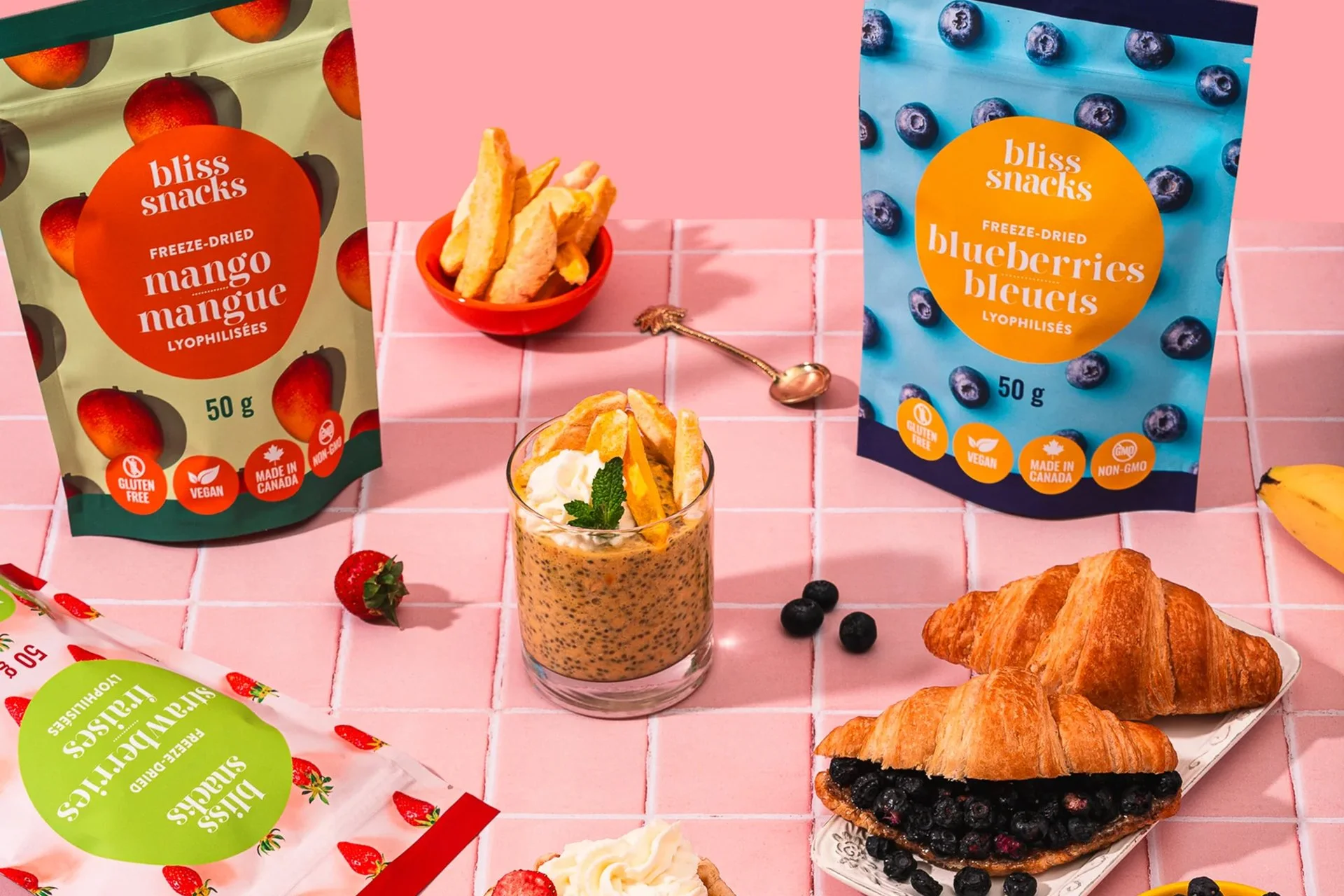
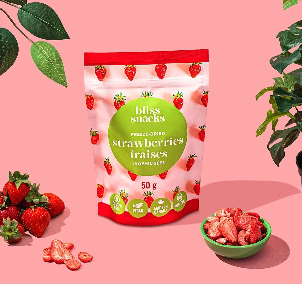
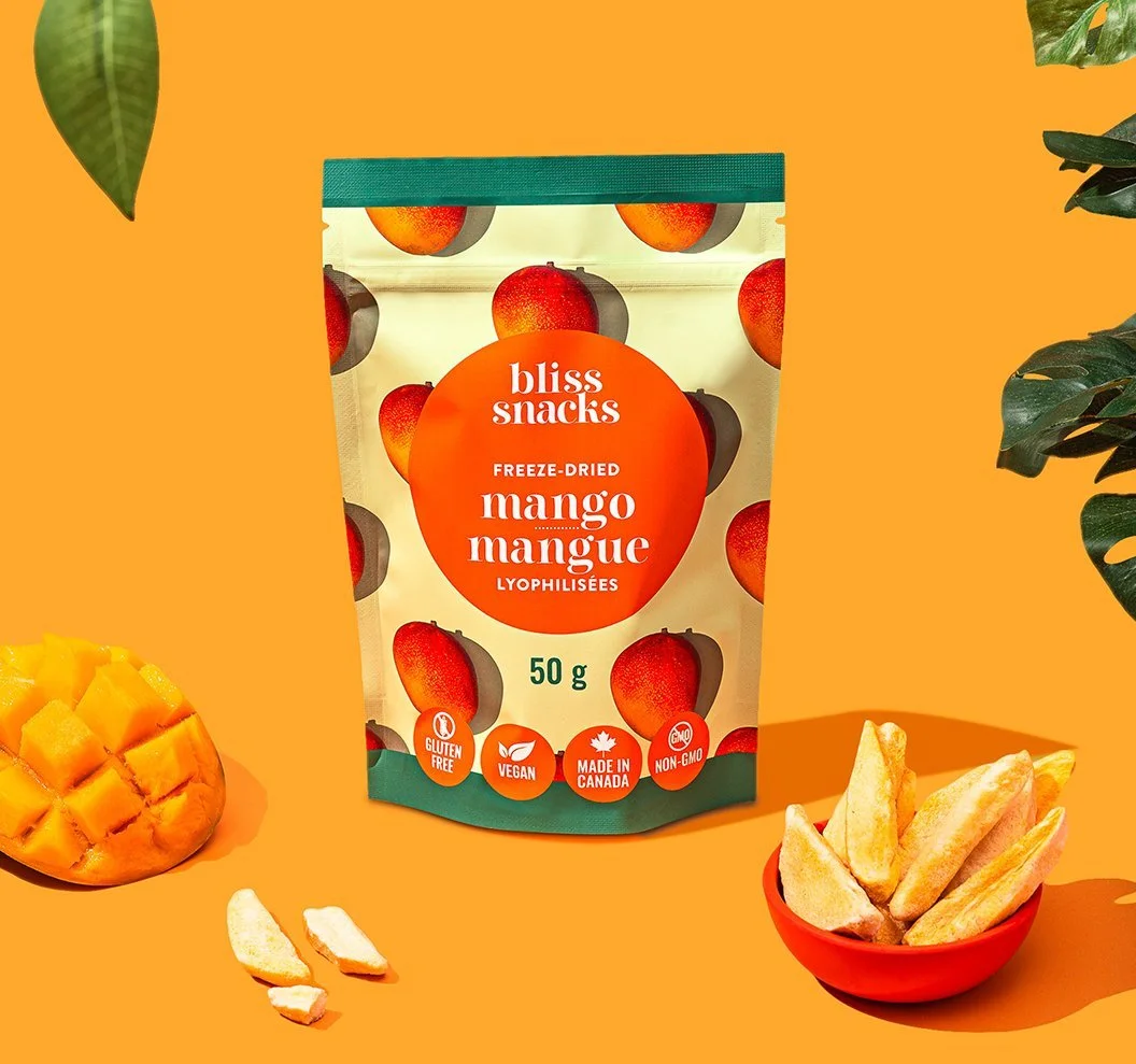
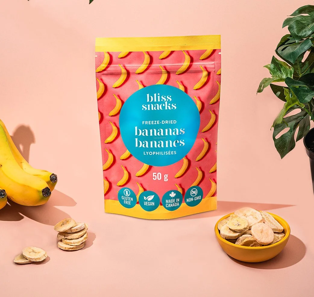
Colour Palette: The design team stuck to Bliss Snacks' signature colours, incorporating vibrant hues to reflect the natural colours of the fruits. This helped in immediately conveying the product’s essence and catching the consumer’s eye.
Typography: Maintaining the clean, modern font used in Bliss Snacks' other products ensured brand consistency. The typography was chosen for readability and to impart a sense of trust and quality.
Imagery and Layout: Stock images were integrated thoughtfully, with an emphasis on showcasing the product in its best light. The design balanced white space with bold images, ensuring the packaging was not cluttered but rather inviting and clear.
Overcoming Constraints Creatively
The use of stock photos was a significant challenge, but it also sparked creativity. By focusing on high-impact visuals that highlighted the texture and appeal of freeze-dried fruits, the packaging not only looked appetizing but also clearly communicated the product's benefits.
The Result: Packaging That Pops
The final packaging design for Bliss Snacks’ freeze-dried fruit line is a testament to our ability to innovate within constraints. The packaging stands out on shelves with its bright, attractive visuals and clear, enticing information. It successfully preserves Bliss Snacks' brand identity while introducing a fresh and exciting new product.
Conclusion
Our work on Bliss Snacks’ freeze-dried fruit product line is an example of how effective design can overcome budgetary and creative constraints. By staying true to the brand’s essence and leveraging available resources in innovative ways, they delivered packaging that not only stands out but also reinforces Bliss Snacks' reputation for quality and deliciousness. This project highlights the importance of understanding and preserving brand identity while pushing the boundaries of creativity and resourcefulness.