
Tide Treats Protein Bar
Tide Treats is a portion-conscious, protein-packed snack bar created specifically for people using GLP-1 medications.
With a satisfying crunch, thoughtful formulation, and bold, modern branding, it’s designed to support appetite shifts without compromise — helping users ride the crave with confidence.
BRANDING
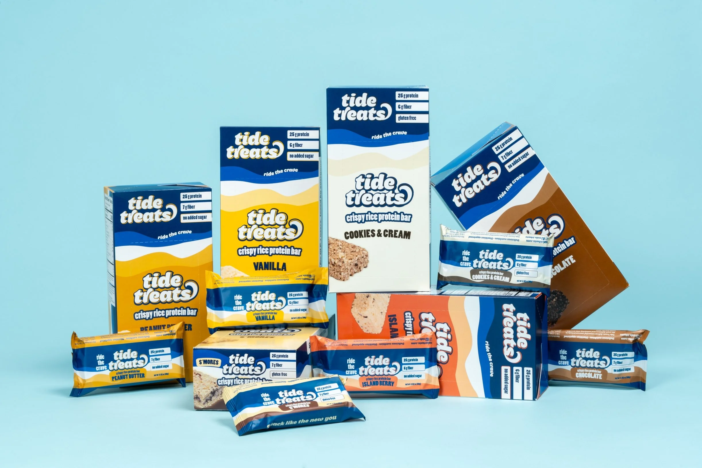
PACKAGING
RETAIL-READY BOXES


The Challenge
Our client approached us with a clear opportunity: develop branding and packaging for a new protein bar designed specifically for a fast-growing audience — people using GLP-1 medications. These users often experience reduced appetite and shifting cravings, and traditional snack bars just weren’t meeting their needs. Most options were too big, too sweet, or simply didn’t feel right.
We were brought in to help fill that gap — crafting a brand that made the product feel purposeful, satisfying, and anything but an afterthought.
The Strategy
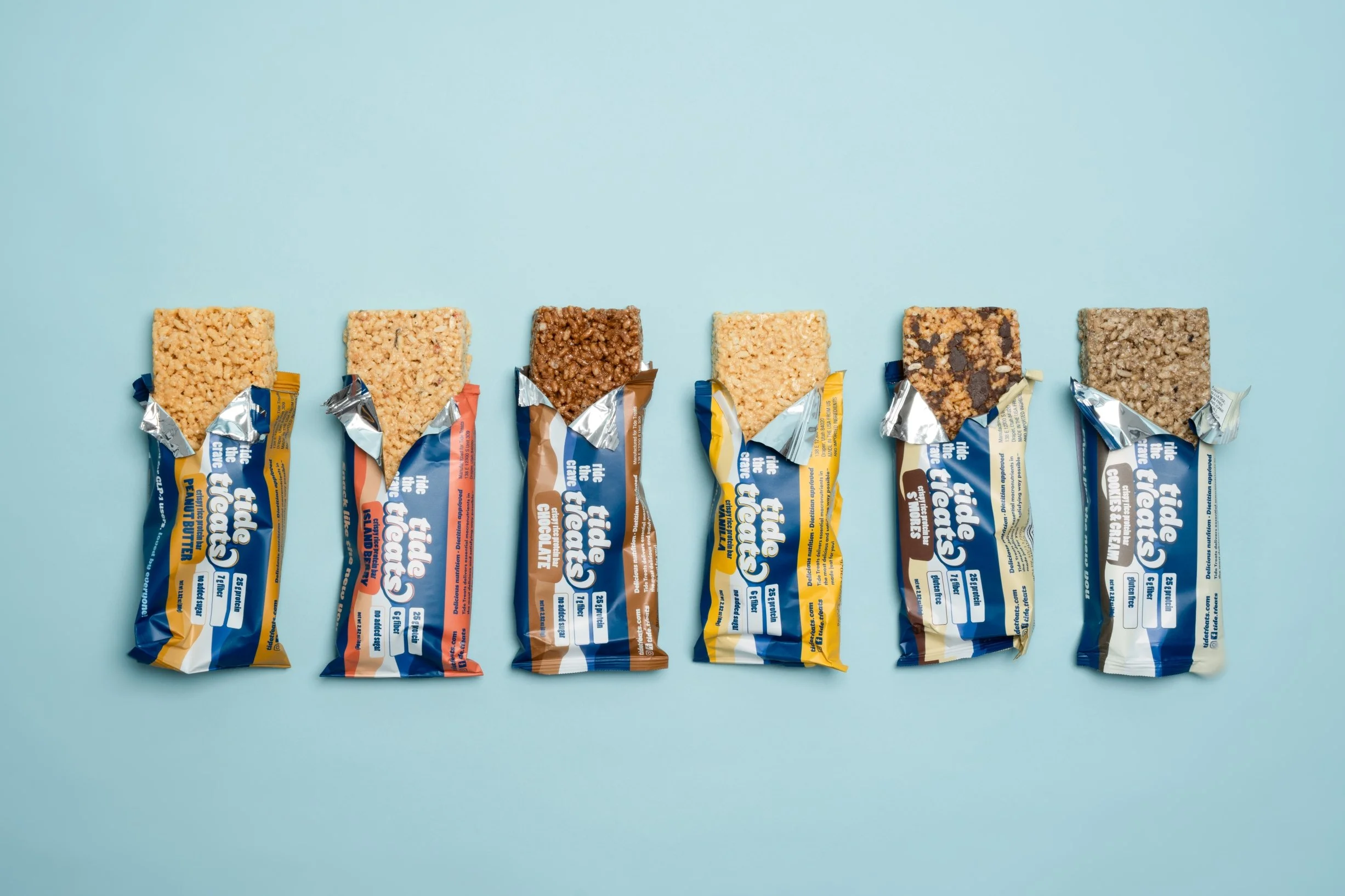
Our approach started with empathy. GLP-1 users aren’t necessarily looking for more — they’re looking for better. A bar that’s portion-conscious, protein-rich, and texture-forward (thanks to crisped rice), offering a satisfying crunch without going overboard.
Starting from this point, we built a brand that’s supportive, and self-aware — designed to meet people where they are and speak their language.
The name Tide Treats came early and stuck. It acts as both a wink and a mantra — encouraging users to work with their bodies, not against them.
The Visual Identity
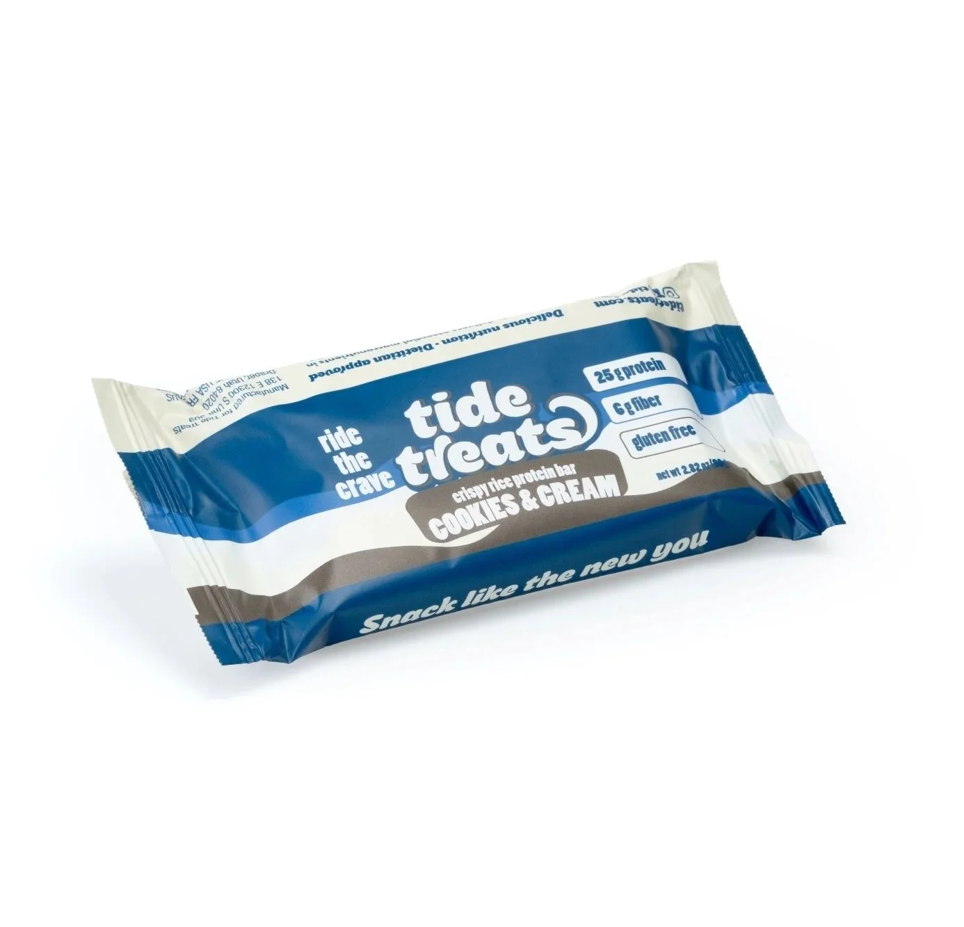
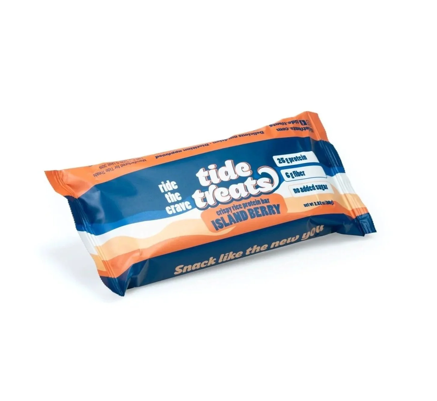
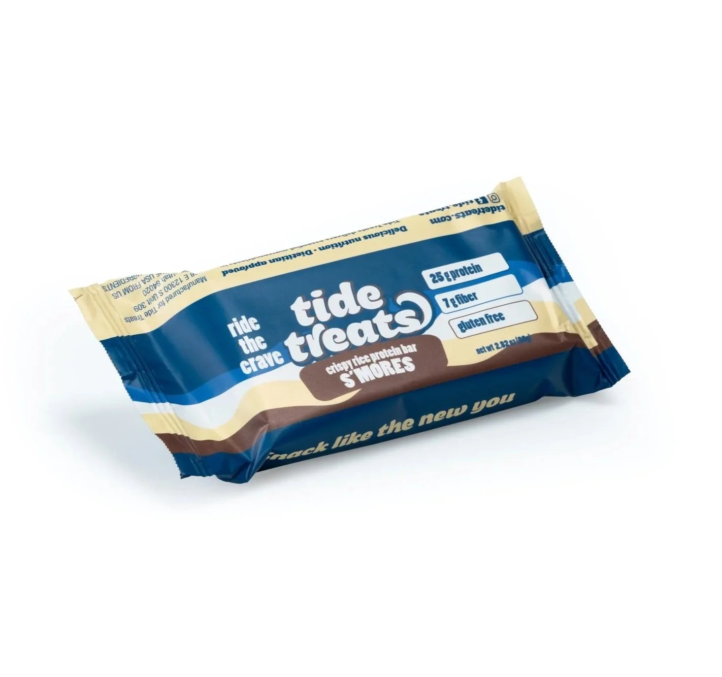
We leaned into bold simplicity with a wordmark that is confident and clean. A bright, focused color palette makes it both shelf-aware and scroll-friendly.
We avoided tired “fitness” or “wellness” clichés in favor of a modern, friendly aesthetic.
Each flavor features its own unique colorway, but the system stays consistent. The packaging feels crisp, compact, and purposeful — just like the bar inside.
Voice & Messaging
Tone was key in making this brand feel right. GLP-1 users don’t need to be lectured or overly cheered on — they want clarity, respect, and a little personality. Ride the Crave was created as the tagline to have this audience understand cravings are your body telling you what you need in the moment.
The Results
This project reminded us that good design isn’t just about standing out — it’s about tuning in. By designing with empathy and clarity, we built a brand that meets people where they are — and helps them snack like they mean it.