Wildflowers Farm:
Herbal Tea Packaging from Farmers Market to Retail
Wildflowers Farm transitioned from farmers market sales to multiple retail locations, requiring a packaging refresh that maintained their natural, handcrafted aesthetic while meeting commercial retail standards.
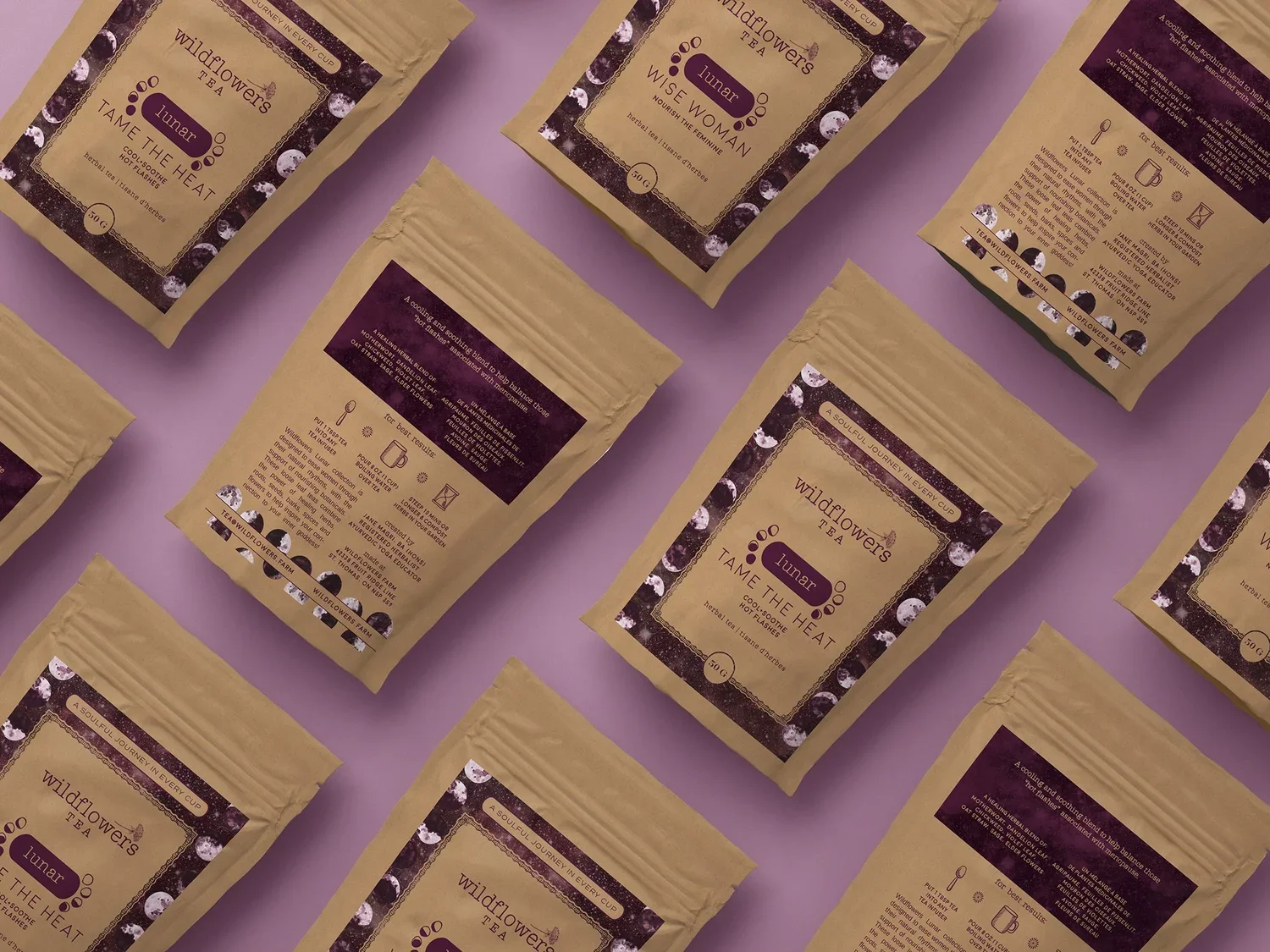
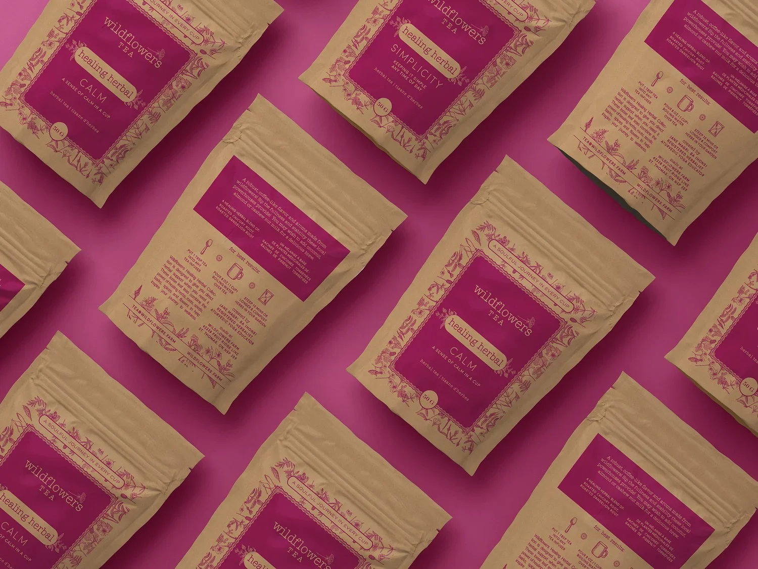
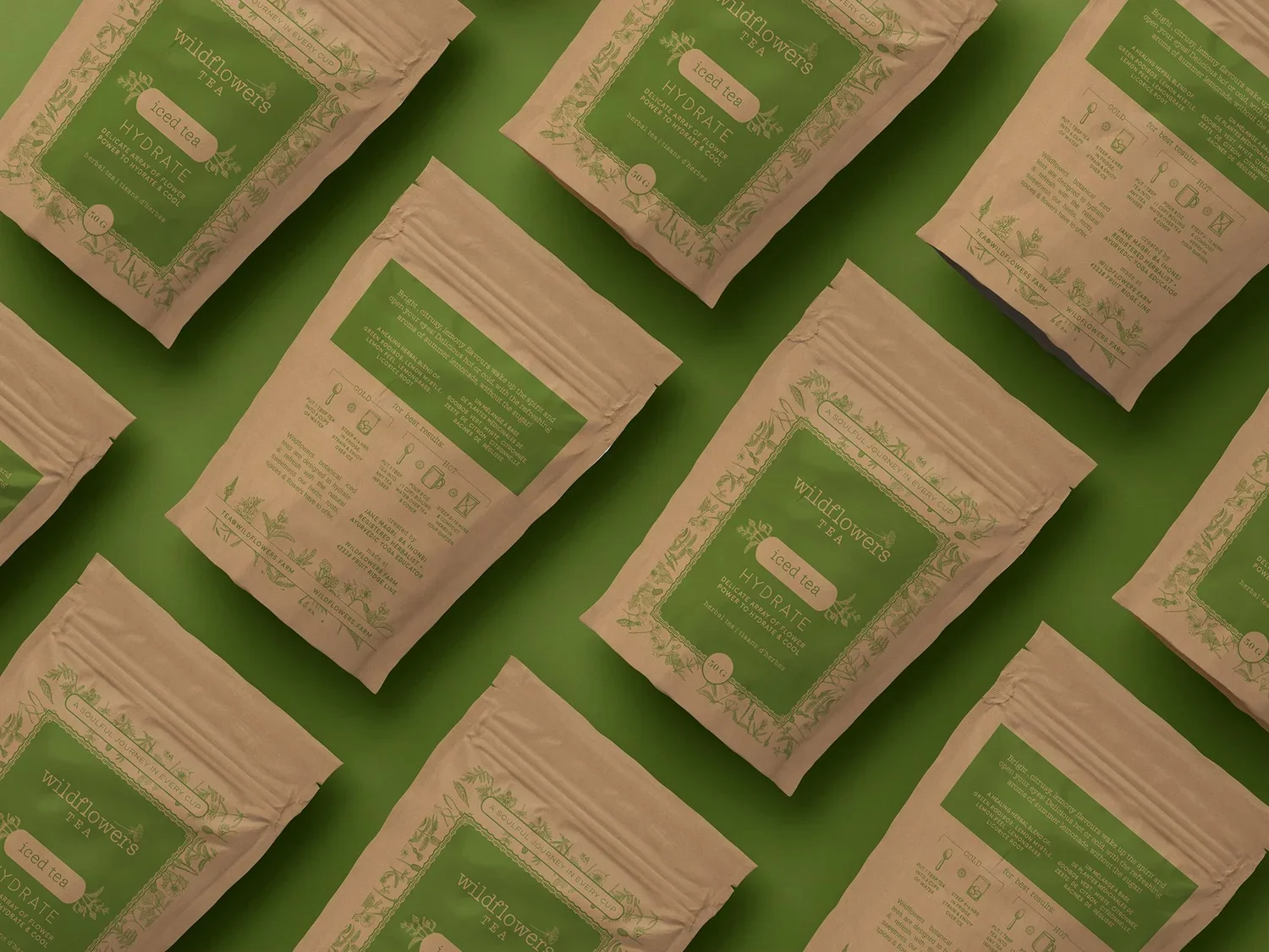
Eye Candy Design created a comprehensive label redesign featuring clear labels with matte finish on kraft packaging, developing unique patterns for multiple tea series—Healing, Iced Tea, Motherhood, Lunar, and Ayurveda—while adhering to a cohesive design template that positions the brand for future growth.
This design is closely aligned to the brand with an appeal that it is built to be futureproof.
CLIENT: WILDFLOWERS FARM
PACKAGING DESIGN
MARKETING COLLATERAL
The Challenge
Elevating Farmers Market Packaging for Retail Distribution
The transition from farmers market table to retail shelves presents unique packaging challenges for artisan food producers. Wildflowers Farm needed to evolve their packaging to meet retail requirements while preserving the authentic, natural brand essence that resonated with their farmers market customers.
Key challenges included:
Adding required ingredient and weight information without cluttering the natural aesthetic
Maintaining the rustic, handcrafted look while achieving retail-ready professionalism
Creating visual differentiation across multiple tea series while maintaining brand cohesion
Balancing clear labelling with visually appealing, eye-catching design
Designing a futureproof system that could accommodate product line expansion
Showcasing the beautiful herbal blends while protecting product freshness
Our Strategic Design Solution
Clear Labels Meet Natural Kraft Packaging
Our packaging redesign embraced the existing kraft packaging's natural vibe while elevating it for retail success. The solution honored Wildflowers Farm's commitment to quality natural ingredients and wholesome lifestyle while meeting commercial packaging requirements.
Clear Matte Label System
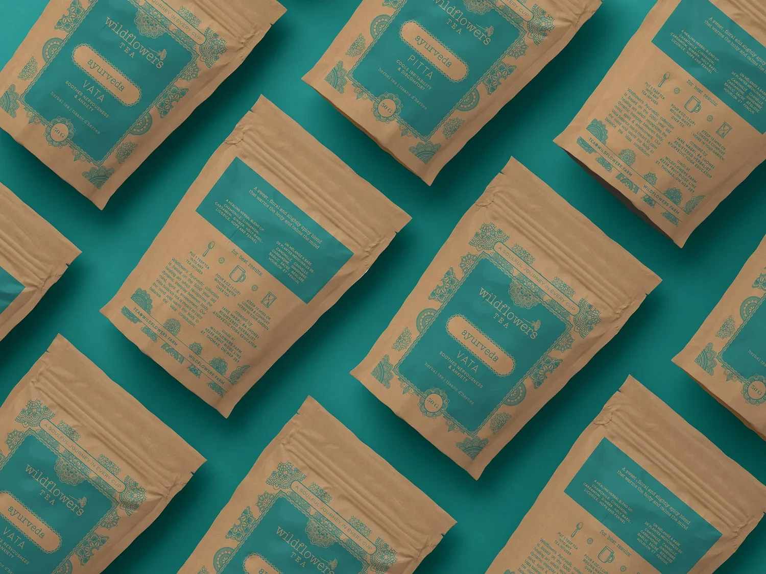
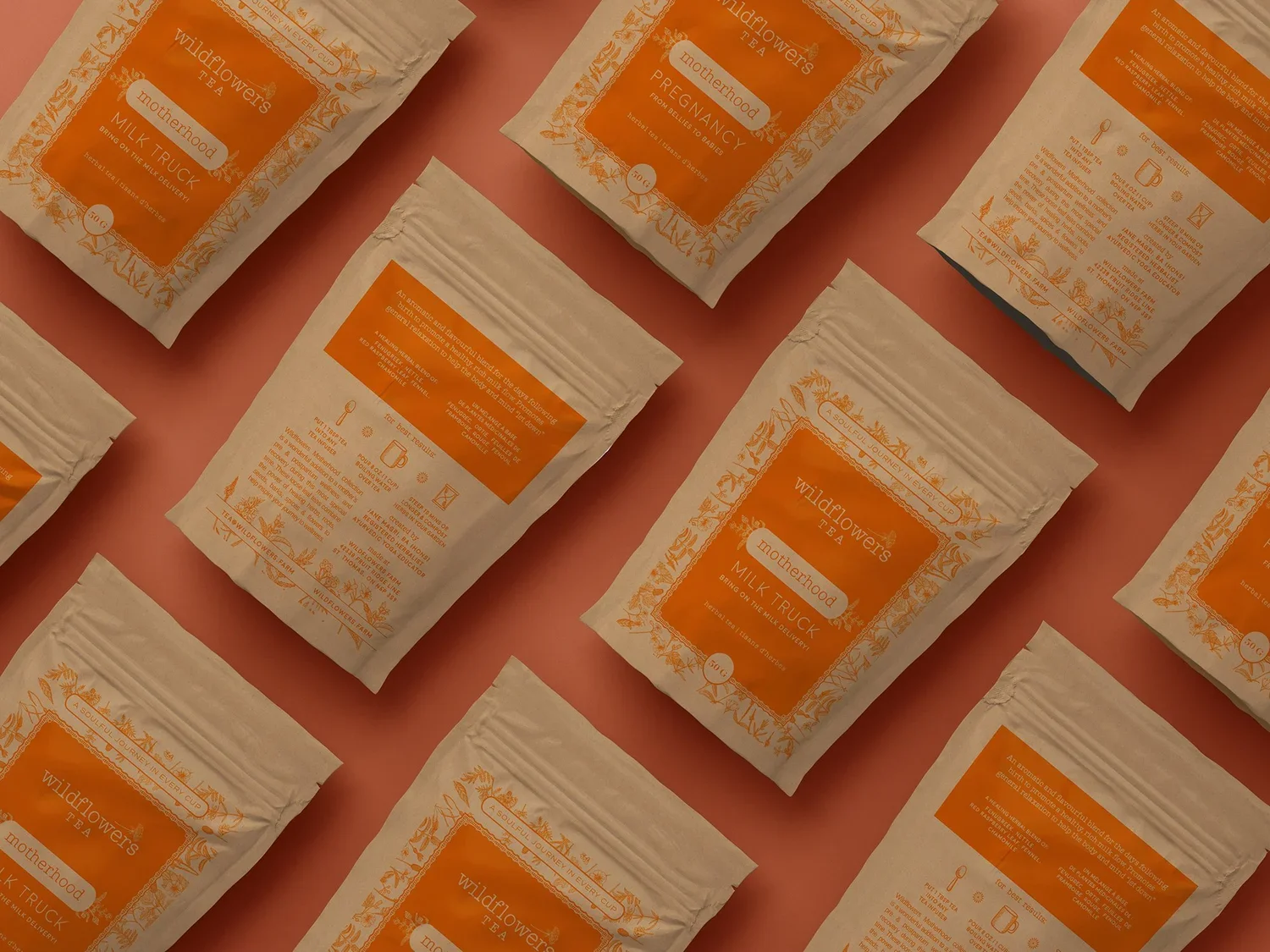
Natural Transparency: We opted for clear labels with matte finish, allowing the beautiful kraft packaging to show through. This approach maintained the rustic, natural aesthetic while providing modern retail functionality.
Pattern Differentiation: Each tea series received its own unique pattern—Healing, Iced Tea, Motherhood, Lunar, and Ayurveda—creating visual interest and product differentiation while adhering to the cohesive overall design template.
Legible Typography: Carefully selected fonts ensured easy readability of ingredient lists and weight information while complementing the natural design elements and maintaining aesthetic appeal.
Showcasing Tea Blends: The clear labels allowed customers to see the beautiful patterns and colors of each herbal tea blend through the packaging, creating appetite appeal and product transparency.
Design System Development
Cohesive Template: Created a flexible design template that maintained brand consistency across all product lines while allowing for series-specific customization and future product expansion.
Natural Pattern Elements: Incorporated rustic design elements including wildflower motifs, herbal illustrations, and organic patterns that evoked "being out in nature, surrounded by fields of wildflowers and herbs."
Futureproof Architecture: The design system was built to accommodate future tea varieties and product line extensions without requiring complete redesign, supporting long-term brand growth.
Retail-Ready Functionality: Balanced the desire for visually appealing design with the practical need for clear, quickly accessible product information that helps customers make informed purchasing decisions.
Results & Market Success
Authentic Natural Brand Elevated for Retail
The Wildflowers Farm packaging redesign successfully bridged farmers market charm with retail professionalism:
Shelf Standout: The unique combination of clear matte labels on kraft packaging created distinctive shelf presence, standing out among traditional tea packaging while conveying natural authenticity.
Brand Essence Preservation: The packaging perfectly captured Wildflowers Farm's commitment to quality, natural ingredients, and wholesome lifestyle—the rustic, natural look remained intact while gaining retail sophistication.
Product Line Cohesion: The unique patterns for each tea series added visual excitement and variety while the cohesive template reinforced brand identity and recognition across multiple retail locations.
Information Balance Success: The design achieved the critical balance between clear, legible ingredient/weight information and aesthetically pleasing, eye-catching visual appeal.
Customer Experience: The clear labels showcasing the beautiful herbal blends created transparency and trust, allowing customers to see the quality ingredients while the patterns added artisanal charm.
Future Growth Support: The flexible design template enables ongoing product development and line extensions without constant redesign investment, positioning the brand for continued retail expansion.
Key Insights for Artisan Tea Packaging
Leverage Existing Materials: Working with existing kraft packaging rather than replacing it maintained cost efficiency while the clear labels elevated the natural aesthetic for retail success.
Transparency Builds Trust: Clear labels that showcase actual tea blends create product transparency and quality communication, particularly valuable for natural/organic positioned brands.
Pattern as Differentiation: Unique patterns for product series create visual interest and navigation cues while maintaining overall brand cohesion through consistent template architecture.
Futureproof Design Systems: Template-based designs that accommodate product expansion save money and maintain brand consistency as artisan brands grow from farmers markets into retail distribution.
Natural Aesthetic Works: Rustic, natural packaging continues resonating with consumers seeking authentic, wholesome products—elevation doesn't require abandoning brand roots.
Conclusion
Wildflowers Farm demonstrates how thoughtful packaging evolution can support artisan producers transitioning from farmers markets to retail distribution. By creating clear matte labels on kraft packaging with unique patterns for each tea series, we maintained the natural, handcrafted essence while achieving retail-ready functionality.
The design balances multiple critical objectives: meeting regulatory requirements for ingredient and weight information, creating distinctive shelf presence, showcasing beautiful herbal blends, maintaining rustic brand authenticity, and building a flexible system for future growth. The clear labels work in harmony with kraft packaging, creating transparency that lets both the tea itself and the natural packaging materials become part of the brand story.
Most importantly, the design is built to be futureproof—so closely aligned to the Wildflowers Farm brand with an appeal that will serve the company through continued expansion. Whether customers discover the teas at farmers markets, specialty retailers, or future distribution channels, the packaging conveys the same commitment to quality natural ingredients and wholesome living that defines the brand.